“Fiordigelso • Plant Nursery & Gardens”
“Wonder & grace
across all seasons”
Year: 2026
Client: Fiordigelso
Scope of Work: Showcase website independent redesign
Project_Details
Client
2026 • uncommissioned (RE)DESIGN, FIORDIGELSO
Field of expertise
PLANT Nursery, GARDENS & SEASONAL PRODUCE
Scope of work
BROSHURE WEBSITE CONCEPT PROJECT
Details
FIGMA • Multi-page showcase website design (ITALIAN)
Overview
Hello there and welcome to my third project.
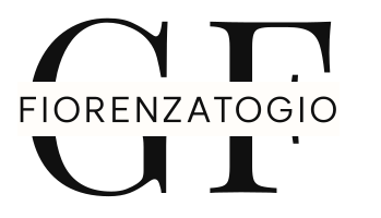
Fiordigelso is an agricultural estate and plant nursery which, since 1982, following their motto in order to create "il giardino dei sogni", devotes itself to specialised garden design and creation, maintenance services, plant cultivation and seasonal organic produce.
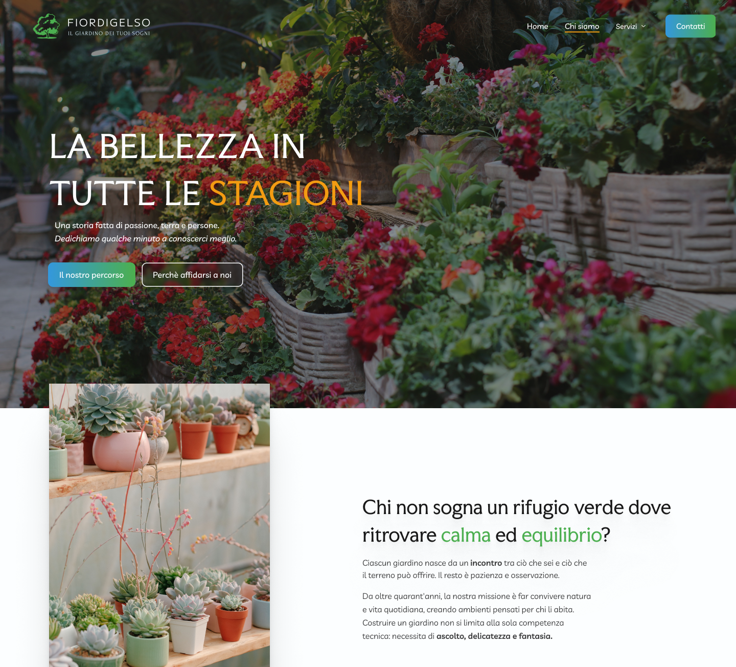
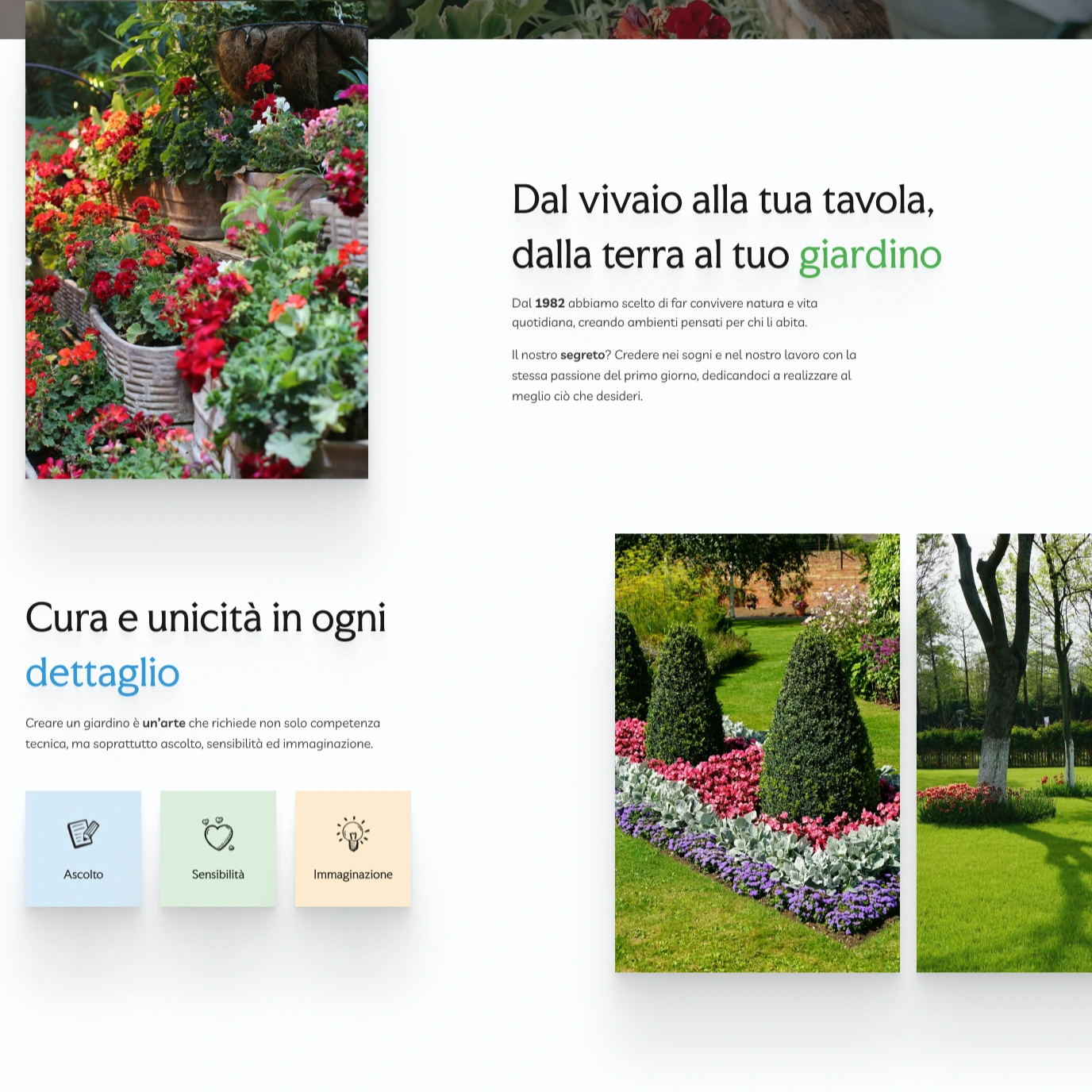
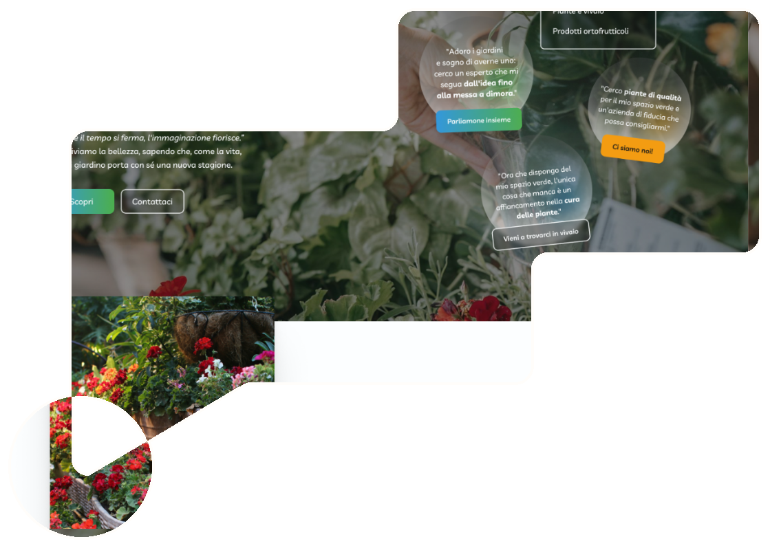
To showcase their work, a multi-page brochure website was created as an uncommissioned concept project with Figma. By combining a thoughtful redesign and a color palette of orange, green and blue inspired by the original branding and reflecting nature and seasonality, the site presents all Fiordigelso services.
The result is a cohesive digital presence that communicates "wonder & grace across all seasons" while serving as a practical demonstration of UX/UI design practices and brand identity creation.

Process Bits & Notes
What sets this project apart?
Fiordigelso mirrors green leaves,
orange harvest and blue skies.
01
Palette
Why Fiordigelso? -- It carries musical rhythm
while remaining grounded in nature symbolism.
Added Value
Palette Choices
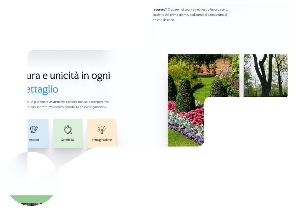
The name reflects botanical harmony: the mulberry tree -- in italian “gelso” -- blooms in spring, bearing discreet flowers and sweet fruits, perfectly aligned with the seasonal cycle.
The chosen palette translates this into visual identity through “Fruit Salad” green for natural charm, “Buttercup” orange for harvest warmth and “Curious Blue” for clear skies and limpid, shimmering water.
What sets this project apart?
Classic poetry embraces modern
warmth and the
soul of nature.
02
Fonts
Why this idea? -- The font pairing creates a
dialogue between excellence, empathy and ethics.
Added Value
Typography System
The fonts create a harmonious equilibrium that mirrors the core values: rooted in tradition and craftsmanship, yet evolving for modern digital experiences.
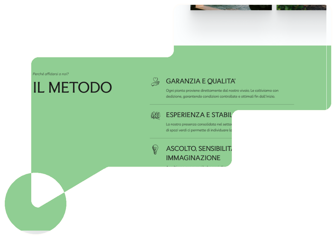
Faculty Glyphic -- inspired by sculpted lettering -- confers refinement and echoes decades of agricultural expertise. Livvic -- with geometrically clean design and softly rounded terminals -- brings freshness and human warmth.
What sets this project apart?
Hand-drawn paper notes
mature into precise digital realities.
03
Workflow
Why a documented workflow? –– It ensures every decision
is traceable and intentional from concept to final design.
Added Value
Design Methodology
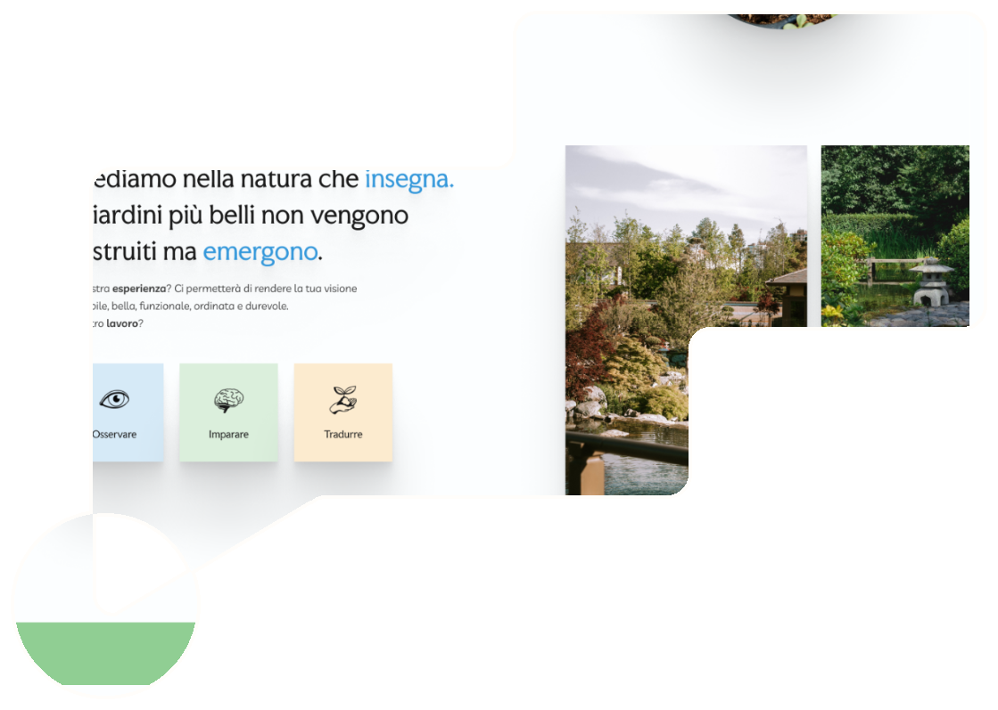
The process flows from hand-sketched beginnings through wireframes and layouts, to finally polished interfaces.
The structured pipeline includes a comprehensive brief template, the definition of a colour palette with primary, secondary, accent tones and gradients -- including shade variations for each color -- and repeated testing to guarantee accessibility and text visibility.
What sets this project apart?
Empathy, excellence and
nature become the center.
04
Heart
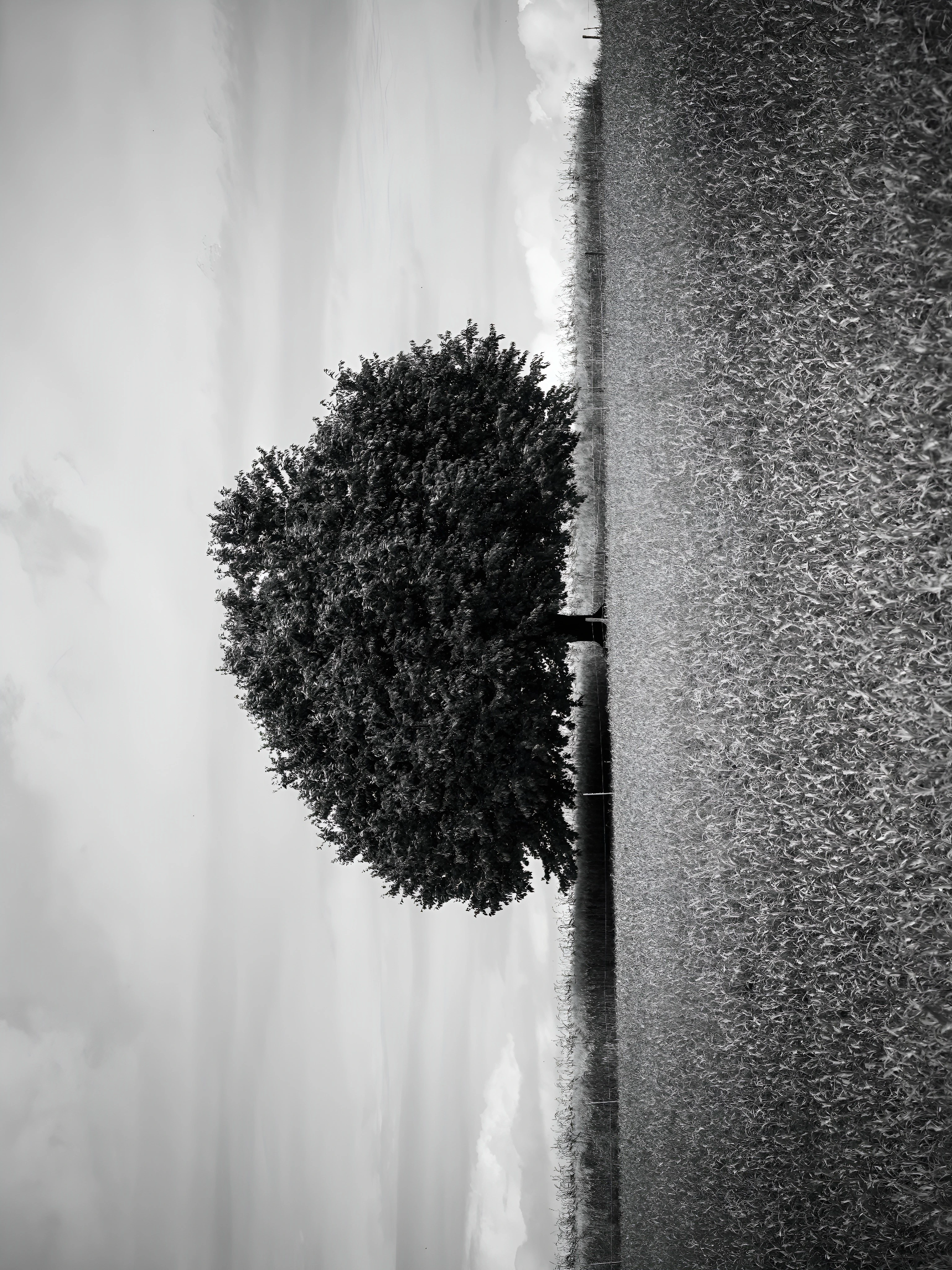
Bits & Notes -- Like a mulberry tree, the design stands firm
in tradition while offering a fresh, welcoming ambiance.
Added Value
Three Pillars
They're expressed in the excellence and professionality shown through decades of expertise, in the order and harmony in every detail and in the empathy and personalization by listening genuinely to each client's unique needs.
Sustainability, passion and love for nature are translated into authentic flavors and fragrances, accessible pricing without compromising quality.
Learning Journey & Context
Beyond serving as Fiordigelso's visual presence,....
... this project was planned as an exercise in concept redesign in Figma, focusing on exploring design thinking and UX/UI skills whilst detaching from the original work.
The gradient from green to blue evokes the horizon between earth and sky, reflecting in turn the motto “il giardino dei tuoi sogni”. From the natural colour palette to the carefully selected typefaces, key learning objectives included documenting the process, studying responsive layout systems and balancing aesthetic vision with accessibility requirements.
The adaptation required reimagining the brand identity, transforming a local reality into a portfolio piece that showcases independent creative direction without infringing on original assets.


(re)design • idea
with
harmony &
clarity
showcase site
Curious about my next project?
StayTuned!